Five User Experience Takeaways from Superstorm Sandy
Superstorm Sandy caused a lot of devastation last month, including leaving millions in the New York area without electricity. While our family was blessed with not having to deal with flooding, a blackout meant no Wi-Fi and only a few hours of electronic device use. We were well prepared for the storm with two fully charged 3G devices, along with other essentials like drinking water, canned food, batteries and flashlights. For the better part of 48 hours without access to high speed internet access, we had to rely on an overly congested 3G network during short bursts of connectivity to the outside world. Accessing email, informational websites, and social apps in that context of use highlighted a few lessons that apply to the way we design and manage online user experiences:
- Prepare users for upcoming changes. Before Sandy hit, banks and insurance companies sent emails offering preparedness tips and suggestions, offering help, and temporarily waiving fees and penalties. A lesson to take away is that we should prepare users for any upcoming changes to their online user experience – like a radical new website design, service or website outage, or expiration of unused points, rewards and credits. Businesses should:
- Offer previews of redesigns. When rolling out a drastic redesign, a best practice is to offer users a chance to preview or use the new site while the original site is still functional. This gives users an opportunity to get familiar with the new site, while still having an option to switch back to the current site if they want to.
- Help users transition to a new design. When launching a redesigned site, send an email about the upcoming changes, or offer a quick online guide to help users get oriented with the new site. This way, users will not be caught off guard when they visit the redesigned site, and will have some help with the new design.
- Prominently highlight exceptions. During Sandy, airlines posted travel advisories prominently on their websites that even the most infrequent flyers would notice and click through. However, these were not displayed on their mobile sites (which most mobile devices defaulted to displaying). Even without a storm, businesses should call users’ attention to other issues like service outages, missed bill payments, or other alerts. When displaying outage alerts, show estimated resolution time, unlike Apple’s website when launching the iPad mini which only said “we will be back shortly”.
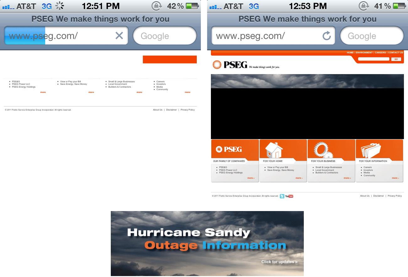
- Design appropriately. Our gas and electric supply company’s page had a 300 Kb banner image that would not load over congested 3G networks. The image had directions for users to get to hurricane updates, but was useless since it would not load. Accessible design includes optimized images with ALT tags, and content organized for user needs. Content and layout should also be optimized for mobile display – including email newsletters that only contain images, which may not show up on mobile devices.
 Top: The images would not load on a congested 3G network, with seemingly no information about hurricane Sandy; Bottom: the 300 Kb banner that would not load, contained the link the users needed.
- Offer users multiple means of contact. And make sure they work. Even after we got power back, our cable TV and internet provider’s phone lines had a recorded “we’re swamped – call back later” message directing users to the help form on their website, which did not work. Businesses should give their users multiple ways to contact you, along with estimated response times.
- Follow up. After Sandy passed and the impact was worse than expected, banks extended their fee waivers, Verizon waived phone and text charges, and Amazon informed me that my order with “1 day shipping” would be delayed. Sandy aside, businesses should follow up to give customer updates, as well as to get their feedback.
Sandy came and went away, but some of these user experience takeaways will serve your users well in normal times, especially when they are faced with limited time, connectivity or bandwidth.

Leave a Comment