Five User Experience Takeaways from Online Holiday Shopping
Yesterday was Free Shipping Day in the US – the last one-day, online-shopping event marketed by thousands of merchants offering free shipping with delivery by Christmas Eve. As the informal end of the online shopping push by retailers to drum up online business leading to Christmas, it comes in last after Green Monday, Cyber Monday and the start of it all – Black Friday. From the looks of it, retailers had a great online shopping season with E-Commerce spending on Black Friday topping $1B for the first time.
Personally, this year was the first in a dozen years that I did not venture out at an unearthly early morning hour on Black Friday. In keeping with Black Friday madness, I had been waking up earlier each year to get my hands on door busters from various retailers. But this year, I did all my holiday shopping online (don’t get my wife started on just how much), and just wrapped it up last night. Here are 5 User Experience takeaways for online retailers based on about a month of online shopping using a phone, tablet and a PC, with over fifty orders placed at over a dozen retailers:
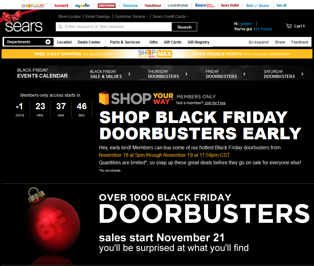
- Reward customer loyalty: Black Friday started over 4 days earlier for members of Sears’ Shop Your Way loyalty program, who could buy some of Sears’ Black Friday door busters the Sunday before. Online. In-stock. No lines in the cold.

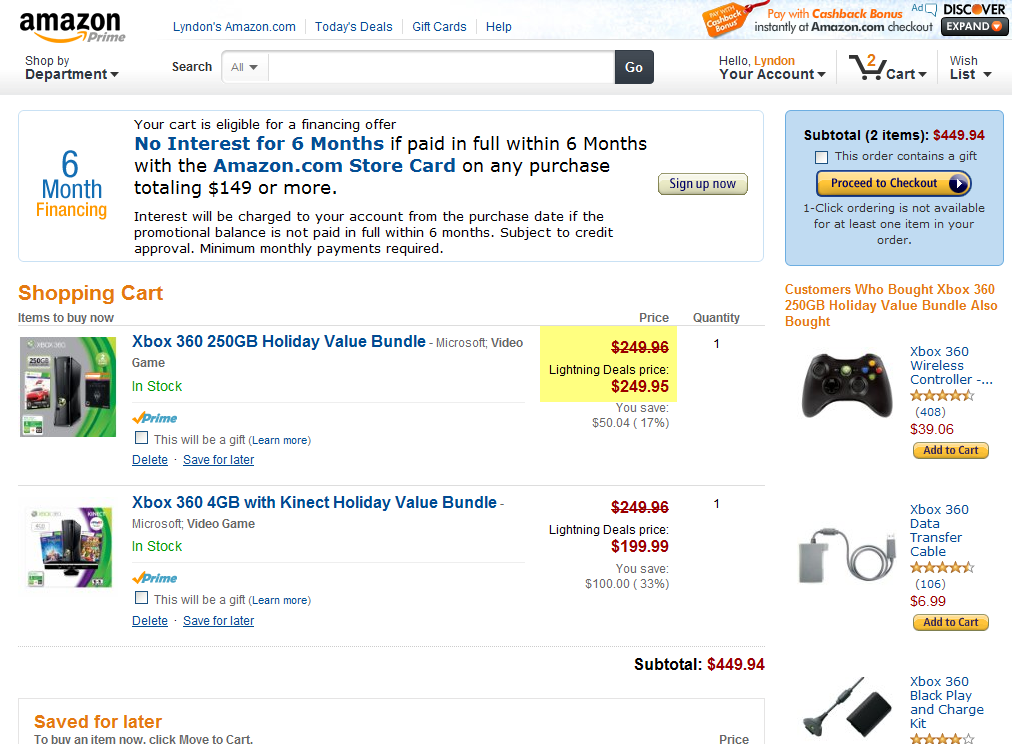
- Don’t tease your users: This is especially true during when discounting products for sales. Informed customers have ways of knowing if a price is really a good price or not, but don’t list items as a deal just for the sake of having an item listed on sale. While Amazon had some great deals during the holiday shopping season, they also had the Xbox 360 a little after midnight, discounted by all of… one penny! Even the most uninformed customers would be frustrated after waiting up past midnight for a so-called deal.

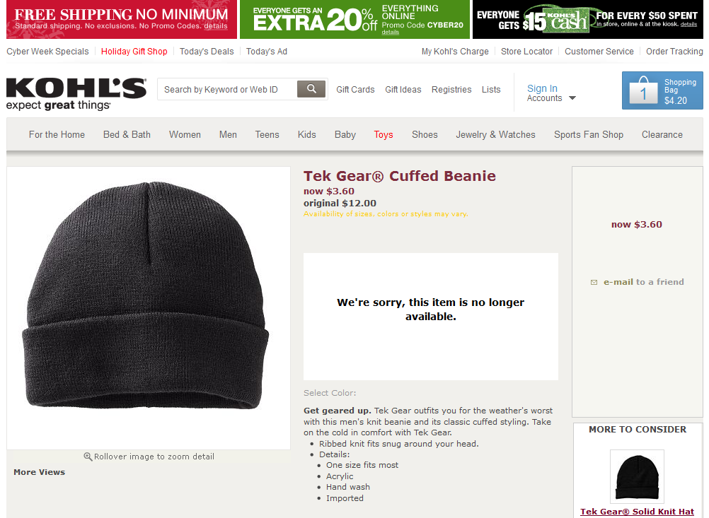
- Show available items by default: Most of the time, people are looking for items that are available, so show users items that are in-stock, like eBay and Amazon do, but give users the option to expand the search to also see out-of-stock items (along with a visual indicator that it is out-of-stock). Kohl’s shows out of stock items in search results without any indication that it is not available, leading to a frustrating shopping experience for customers when they have to click through only to find out items are not available.

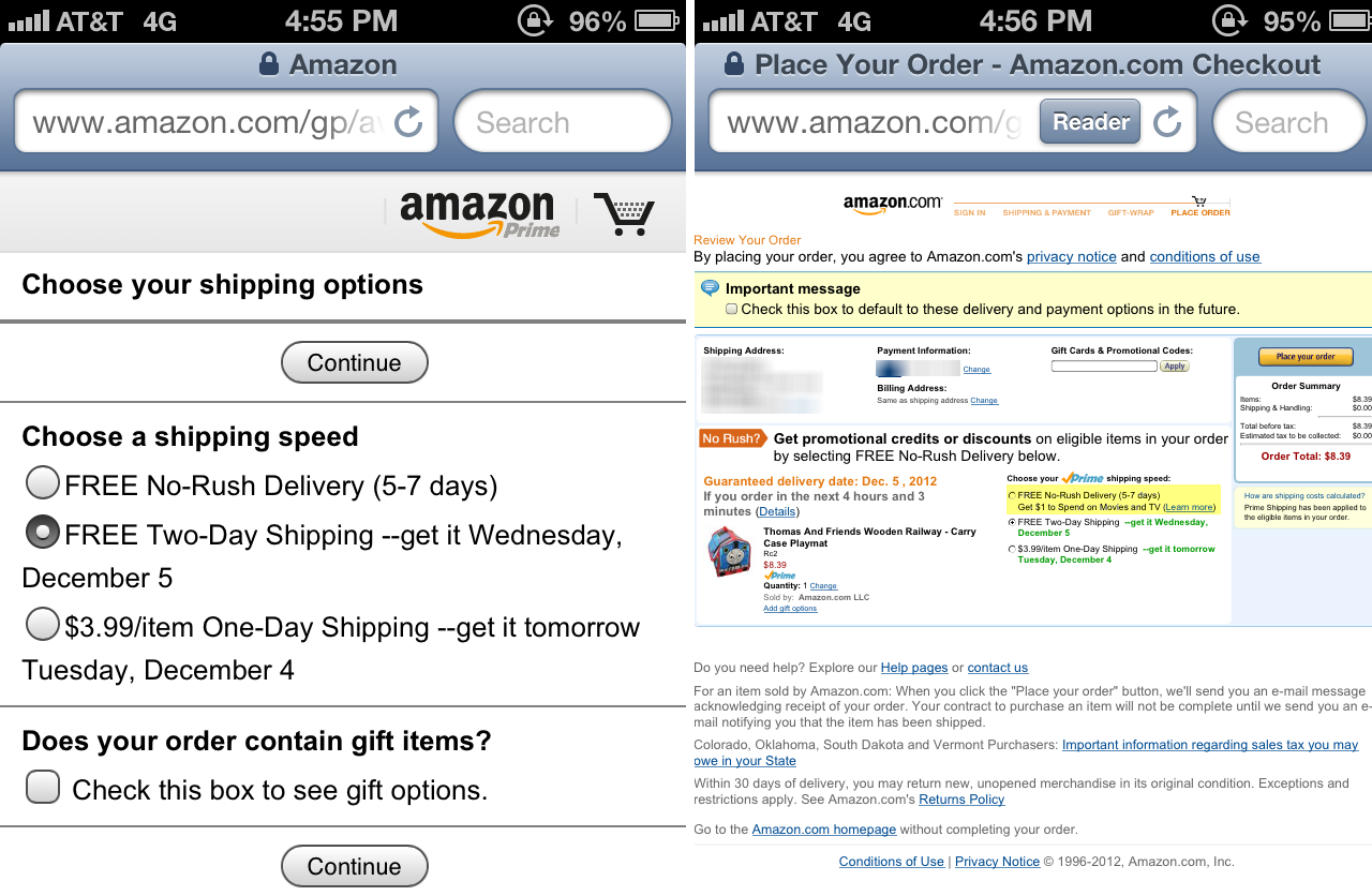
- Encourage users to shop online: Reduce some of the barriers to shopping online by making the purchase and return process painless and risk free. For the holiday season, many online retailers extended the return period until January to cover returns after holiday gifting. Amazon’s Prime Shipping subscribers who shopped early were also offered an incentive if they were not in a hurry to get their items.

But as you can see from the screens above (click to enlarge), the incentive did not correctly show up on the mobile site, which brings us to the next takeaway… - Improve mobile offerings: Retailers are still trying to figure out mobile and multi-channel offerings – the Staples app directed users to the mobile website for one-hour Black Friday deals long after they had ended that morning. Visitors to the mobile website were then directed to the full site for “additional sales”, which is a whole lot of unnecessary channel switching for users.

With the online holiday shopping season ending, the Santa in brown (UPS delivery man) will no longer stop by my home daily. Come to think of it, maybe I should leave some milk and cookies out for him…

Leave a Comment