Noah’s Transition To Mobile Usability Testing
Noah was concerned. He was the “UX Guy” for the corporate office of a regional Quick Service Restaurant (aka fast food chain) that was in the process of creating a mobile app that would allow their customers to customize their meals, place orders and earn rewards. He had been seeing users’ expectations increasing, and they were less forgiving of poor mobile experiences. That’s why he firmly believed that it was important to test the usability of their mobile user experience given users’ higher expectations, smaller screens, and constraints of wireless, battery-powered devices. Noah was concerned because he had never conducted mobile usability testing, even with years of traditional usability testing experience. That, and the fact that the first round of testing was just a month away.
He quickly realized that mobile usability testing had more similarities with traditional computer usability testing than differences. The biggest differences were in the actual testing itself; everything leading up to the actual test, and following the test remained the same. He had many options available to conduct usability tests, including
moderated or unmoderated, remote or in-person and combinations thereof. While unmoderated remote testing allowed him to cast a wider net with many more participants, it did not offer opportunities for contextual probing. As he researched available options, Noah bookmarked services like UserZoom and UserTesting as potential options for future remote testing needs. His past experience had taught him that moderated in-person testing provided rich user insights that were often missed using other methods. It would allow him to focus on certain features and functionality with a few participants, as well as probe concepts they were exploring, making it his preferred approach for their upcoming rounds of testing.
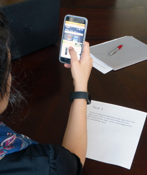
Mobile usability testing setup.
A month before the first scheduled usability test, he began preparing for the tests, starting with the parts that he knew best. Let’s follow Noah as he makes the transition from computer usability testing to mobile usability testing.
A Month Before
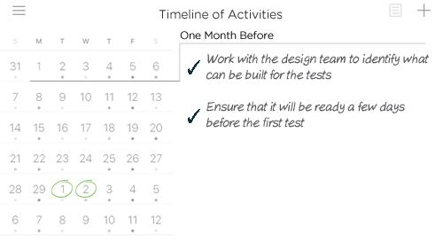
The design and development team slowly trickled into the post-lunch meeting Noah had scheduled, a few tempted by the brownie bites he had promised. He used the meeting to review the functionality and features that were to be tested in the first usability testing session. Since they were currently in the design phase, they would be conducting usability testing using a prototype of the iOS app. The team had just completed rough screen designs and was just starting to create an interactive high fidelity prototype that would allow users to complete tasks as if it were a live app or site. The design lead helped himself to the last (and his third) brownie bite as he promised to have the app prototype ready a full week before the first usability test. Noah set a reminder for that date on his phone.
Three Weeks Before
The following week, Noah started the crucial first step of creating a
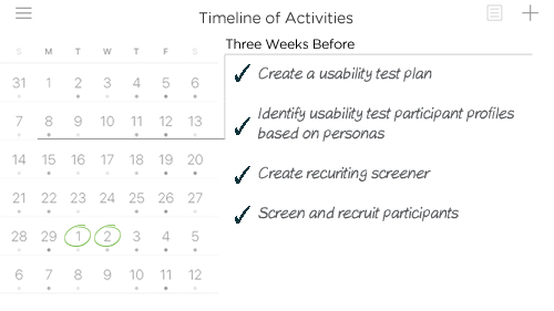
usability test plan that documented the what, why, when, where, who and how of the usability test. Past experience had taught him the importance of having key stakeholders and project team members sign off on the details in the plan. This ensured that the usability test was testing the right features and functionality, with the correct representative audience, on appropriate devices, and that the right metrics were being collected and reported. In addition to the testing plan, he also prepared the other documents that would be required for the tests, including a non-disclosure, compensation receipt, and release forms.
Noah knew that equally important for a successful usability test was finding the right participants, since
one size does not fit all. As in the past, Noah used their project
personas to identify the profiles of participants he would be using for testing. He turned to his usual market research firm to create a screener to
recruit the right participants from their opinion panel. Since they were building an iOS app, the screener also included questions to ensure that the participants used iPhones running iOS 7 or higher, to ensure that they would be familiar with platform conventions and flat design.
He still needed help figuring out setup and recording options for the tests. A fan of “Who Wants to Be a Millionaire”, Noah used the equivalent of Ask the Audience lifeline to solicit feedback from a few LinkedIn UX groups about setup options for moderated in person mobile usability testing. A big believer in sharing knowledge, he also promised to compile and share the collective wisdom with those groups.
Two Weeks Before
Noah’s queries on LinkedIn and Quora slowly started getting responses, but many replies were from others looking for answers too. He started clipping and collecting useful approaches in Evernote as he was notified about new replies.
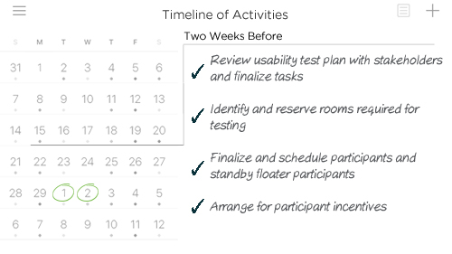
Noah emailed Pat, his contact at the recruiting agency, for a status update and got a response within the hour. They were almost done with recruiting for this round with 5 of the 7 slots filled, matching the personas profiles, as well as 3 floaters in case there were no-shows. Pat’s team was waiting to receive confirmations from their panel for the remaining two slots. She promised to send across the participant profile summaries by the end of the week. Fully aware that his accounting department was bureaucratic, he submitted a requisition for gift cards to be used to compensate participants for their time.
Since he was going to conduct in-person usability tests, he needed to identify a suitable location. Noah had conducted his share of usability tests in formal usability labs, but he did not feel that was necessary for these tests. He scouted their corporate office for rooms he could use – one for testing, another as a waiting room for participants, and the third as a debrief room for the team. He found a quiet windowless room with in the middle of the building for the usability test and two others with nice outdoor views and quickly reserved them for the tests.
His most important goal for the week was to complete the stakeholder review of the test plan. He had emailed the plan to the project stakeholders including marketing, IT, and creative design two days before their usual Thursday morning meeting. He had asked them to come prepared with their feedback, specifically around the tasks to be tested. The creative team had a few tweaks for the tasks and IT had none, but Chad from marketing had gone through it with a fine-toothed comb; his feedback included adding a few additional tasks, and detailed follow up questions for everything from branding to labeling. Noah explained that they realistically could complete no more than 4 main tasks in their hour long test, and worked one-on-one with Chad the rest of the morning to finalize the tasks in the test plan.
With the tasks approved, Noah turned his attention to his options for recording the usability testing sessions. He had plenty of options for recording the screen as well as the participant’s reactions when using a computer, thanks to inbuilt webcams and screen recording software. However, recording a mobile usability session was complicated because most of the ways to capture similar recordings could be obtrusive and may impact the usability test. That’s where he was hoping his Ask the Audience lifeline would help; he organized the dozen responses and they all converged to 4 ways to record a mobile usability session. Remembering his offer to compile and share his findings with the others on the groups, Noah started documenting the options.
| Recording Setup Approach | Mobile Web | iOS app | Android app | Pros | Cons |
|---|---|---|---|---|---|
| Table Camera Document camera focused on the mobile device on table; separate webcam for recording participant. e.g. IPEVO |
Y | Y | Y |
|
|
| Cradle Camera Webcam attached to a cradle attached to mobile device; separate webcam for recording participant. e.g. Mr. Tappy |
Y | Y | Y |
|
|
| Mirroring Mobile device screen is mirrored on laptop using software; separate webcam for recording participant. e.g. Reflector2 |
Y | Y | Y |
|
|
| Mobile Recorder Mobile app with built in browser based recording of screen and recording participant e.g. UX Recorder |
Y | N | N |
|
|
Just as he shared his findings back in the LinkedIn groups, Noah’s phone chirped to remind him about his Friday night dinner date with his wife in an hour – time had flown by! He quickly put his computer in hibernate mode and headed home for the weekend. This had been a long, but fruitful week.
One Week Before
Noah had been thinking about his options over the weekend and was leaning towards the last option – using an app like UX Recorder to record the test, without any additional equipment. Back at work, the project team agreed with his choice, but the UX Director asked him to validate it with a usability specialist from their local UX Meetup. Noah set up a working lunch the following day with the specialist, Diane, who had been conducting mobile usability tests for the past couple of years.
As he worked through his email backlog from the weekend, he saw the completed participant profile list from the recruiting agency. He scanned the profiles, mentally confirming that he received the exact persona profile breakdown he was looking for. However, one participant’s profile did not seem to fit their persona, with characteristics like income not matching the expected range for that persona. He emailed Pat at the agency to find a replacement for that participant.
The following day, he met Diane at one of their restaurant locations, for what felt like an Ask An Expert lifeline. He had come prepared with a list of topics he wanted to discuss and a printout of his test plan as well as the recording setup options. He had first met Diane at their local UX Meetup over a year ago – she was a self-appointed one-person welcoming committee and quickly put him at ease in the group of 70 or so UXers. While they waited in line to place their orders, Diane talked about the usability test she had just wrapped up, including the kindly grandmother who was reluctant to accept compensation. As they waited at their table for their meals, he explained that they were planning to conduct in-person moderated usability testing using a prototype of their iOS app, and he was hoping for her guidance on his choice for recording the test. She had used all those approaches in the past and after asking him a few more questions about the test, she validated his choice.
During the meal, he asked her for suggestions on factoring in mobile context (things like the environment and circumstances of usage that affects the interaction between the user and the interface). She explained that in a lab setting, the best option was to simulate that context. She immediately recalled one of his tasks about placing a fast food order and picking it up, and said that she would first probe about their order pick up expectations. She would then introduce the concept of how they were thinking of using geofencing to begin cooking their order, and try to get participant feedback on the concept. She promised to email him a few more pointers before the end of the day. He thanked Diane for her guidance as they left the restaurant.
Toward the end of lunch, his phone had reminded him that the design team had promised to have the prototype completed by today. Back at the office, he headed over to the design team room to get a walkthrough of the prototype. The design lead apologetically explained that they had to rethink some of their designs based on some last minute direction from Marketing. He said they were aiming to have it all completed by the weekend. This was cutting it too close for Noah’s comfort, since he usually conducted a dry-run a few days before the test, giving the team time to make any last minute adjustments. He tried to take his mind off that by updating the order placement and pickup task to simulate context based on Diane’s suggestion.
As he was making updates, he received Diane’s email with some pointers.
Subject: Mobile Testing Pointers
Noah, as promised during lunch, here are a few pointers to keep in mind as you setup and conduct your tests next week.
Thanks for lunch and all the best!
Diane
Devices / Platforms: If participants are not using their own devices, make sure they testing on the platform (iOS, Android or Window) they are familiar with and use regularly. If they will be testing using their own devices, factor in the logistics and time to install the app, setup any access etc.
Glare: With computers, you could adjust your screen to accommodate for any lighting issues, but glare becomes an issue with mobile, when using a camera to record mobile screens (the first two approaches you had outlined) since users tend to move the mobile devices for more comfortable use, sometimes rendering parts of the recording useless. If you ever use the document camera setup (first approach), use painter’s tape to remind the users of the zone the mobile device needs to stay within.
Battery / Power: Another mobile-only issue is ensuring that devices being used have sufficient juice for the test, and long charging cables are readily available. The first time I used UX Recorder on a personal device for a dry run, halfway through the test we had to stop the test and scramble to get a charger cable – the screen, video and audio recording drained the battery faster than I ever imagined.
Last but not least,
Notifications / Alerts: Turn off ALL alerts and notifications on test devices. Not only does it interrupt the test, it may impact your recording.
Noah made a note to double-check these during the dry-run, which now had to be rescheduled for the day before the actual tests. Next week was going to be a long week for him…
The Week Of Usability Testing
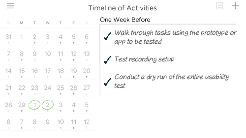
Bright and early on Monday morning, Noah brought in a Box O’ Joe and donuts for the design team, who had worked part of the weekend to complete the prototype. They spent the next hour collectively walking through the prototype and noting a few minor changes. The design team would have the updates completed before lunch, which would give Noah enough time before the pilot test that afternoon. He sent a reminder email to his colleague, Emma, who had volunteered for the dry run. Emma had not been involved with the app and except for being a brand fanatic as an employee, was as good a test participant as they could hope for.
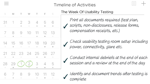
He started his final preparations for the tests by printing documents required including non-disclosures, release forms and compensation receipts. He also purchased test credits to use UX Recorder to record the pilot test. Being cautious, he also had two webcams ready with stands as a backup. He configured the recording options in the app, launched the prototype through the app browser, and recorded himself clicking through a task. So far, so good!
Noah and Sophie, the assigned note-taker for the sessions, reached the room reserved for the usability testing 15 minutes before the test, only to find Emma already waiting for them. As Noah set up, he explained what they were hoping to accomplish in the next hour. However, he could not bring up the prototype in the recording app – he quickly realized that his phone did not have a cellular or a wireless signal, probably because of the room’s location in the middle of the building. He apologized and went to try out the other rooms he had reserved as the waiting and debrief rooms. In the first room he tried, the prototype loaded without a delay – his phone had a strong cellular and WiFi signal. He walked Emma and Sophie over to the new room just a few minutes later than the original start time. He explained the ground rules and the process before initiating the recording in the app. Four tasks and 70 minutes later, he stopped the recording and thanked Emma for her help. While the app was exporting the recording of the hour long session, Sophie and he discussed the session, identified a task they needed to reword to avoid confusion, and looked for areas where they could trim some time from the actual sessions. That’s why he always conducted at least one dry-run session before the actual tests – it helped him get familiar with the tasks as a moderator, allowed him to verify that the tasks were clear to an outsider, and make any time adjustments if needed.
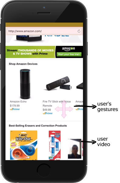
The first day of usability tests started bright and early Tuesday morning, and Noah was back in his comfort zone as the moderator. The four scheduled tests went smoothly, and Noah and Sophie used the time between the tests to debrief and capture highlights from the session on the whiteboard-wall. The only hiccup was that the phone received an incoming call during the third session; he asked the participant to dismiss it and continue with the test. Though he had turned off all alerts and notifications as Diane had suggested, the call somehow made it through. At the end of the 4 scheduled tests for the day, as the session recordings were being exported, they started identifying preliminary trends from the session highlights on the whiteboard-wall. The first two rendered without an issue, but the third session appeared to be corrupt and could not be exported. Thankfully, the last one rendered without an issue. He sent an email to the app support team along with logs of the corrupt video, concerned that this issue would repeat the following day.
The first scheduled participant on Wednesday was a no-show, so they conducted the test with their standby floater. After each test that day, Noah restarted the iPhone in the hope that it would prevent any other corrupt recordings, since he had not heard back from the app support team. He breathed a sigh of relief when the three recordings of the day rendered without any glitches. Sophie and he spent the rest of the afternoon reviewing all their notes and recollections, and continuing their trend analysis. Looking back at the tests, he also noted that none of the participants had trouble with the simulated mobile context even though they could not test it in the real world.
Noah ended the week with a debrief meeting with the project team to share the key findings, and offered to host additional sessions the following week.
The Week After
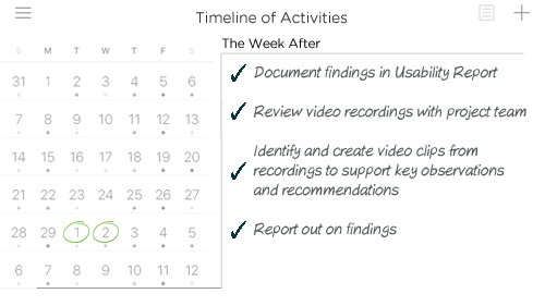
Over the weekend, the mobile recording app support team emailed Noah, admitting that they could not figure out why the third video was corrupt, but sent him step by step directions to locate and share the raw video clips from the iPhone. Not feeling very hopeful, he zipped, uploaded and shared the 2Gb file with them.
As they were making good progress on the final usability test report, Noah scheduled a report out with key project stakeholders and the project team for Friday afternoon. Noah and Sophie spent the rest of the week analyzing the data, updating trends, and documenting key findings along with severity and recommendations for improvement. Though there were many templates and formats for reporting out findings, Noah liked using a PowerPoint format he had tweaked over the years, which allowed for a visual show-and-tell report out. He was a big believer in the power of short video clips (or a montage) of users struggling with a certain feature to create an “a-ha” moment for those who were not part of the testing. Sophie cropped out the video clips to contextually support a few key observations and recommendations.
Every day during lunch that week, Noah led a video review session with the project team, reviewing a different participant’s video recording each day. This not only helped the team witness firsthand how users interacted with their app prototype and where they stumbled, but also surfaced a few observations and insights that Noah and Sophie had not captured.
The final report out session on Friday afternoon was well attended by all the key stakeholders. Noah presented the high level findings and Sophie went into the details. They fielded a couple of questions about observations and recommendations that were different from what the steering committee had originally envisioned for the app. As Noah had seen time and time again, the supporting video clips were sufficient for the stakeholders to sit up and take notice and start conversations about changing their course.
As he headed home for the weekend, Noah reflected on the past six weeks his first mobile usability test – his concerns at the start had been overstated. His transition to mobile usability testing had been relatively easy, since he had previous experience with traditional computer usability testing. The setup was the biggest difference between the two, and there were some mobile related nuances that he had to take care of, but it was not like learning a whole new skill.
Over the months that followed, Noah’s ongoing usability tests helped the project team fine tune the app as it progressed from a prototype to a fully functional app. For the launch and every major release that followed, the app received a majority of 4 and 5 star reviews.
Resources & Links
Planning Templates & Recording Setup
- Planning A Usability Test
- Usability Test Screener – Mobile Device Testing
- Usability Test Plan Template
- A Guide To Simple And Painless Mobile User Testing
Mobile Testing Checklists
- Detailed checklist and other downloads from Steve Krug’s Rocket Surgery Made Easy
- UserTesting Mobile Usability Testing Checklists (free signup needed)

Leave a Comment