
Impact of the Government Shutdown on Federal Website User Experience
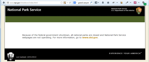
As I write this, the calendar marks day 14 of the US government shutdown. There is enough finger-pointing going around, so let’s focus instead on the impact to users of federal websites. With some vacation time coming up in December, I was planning a family vacation to Arizona. The first result in a search for “grand canyon” was a link to the U.S. National Park Service, which led me to a message that the website was also shutdown (see below) – an online dead end!
Thankfully there were many alternate sites, and I could continue planning our trip. The experience however got me interested in how other federal websites were impacted by, and handling the shutdown. Federal websites that were impacted by the shutdown broadly handled the online user experience in one of three different ways:
- Complete Shutdown
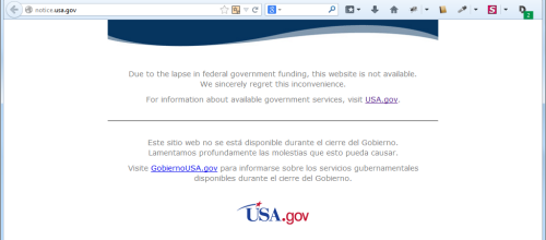
Sites like the U.S. National Park Service above and NASA (below) displayed a generic message about the shutdown without any way for users to get into the site. NASA.gov redirected to a generic page on usa.gov, displaying a message in both English and Spanish with appropriate links.
- Partial Shutdown with inconsistent messaging
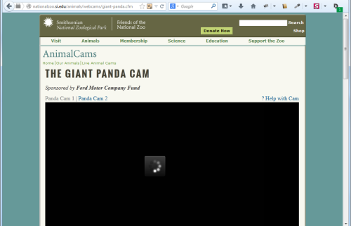
The Smithsonian National Zoo on the other hand, displayed a prominent message on the homepage informing users about what would not be available during the shutdown – both in the real world as well as on the website (like the live animal cams).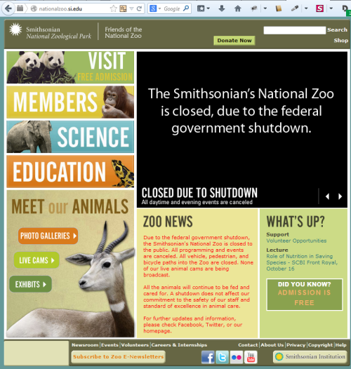 However, if users arrived at one of the animal cam pages through a bookmark or a search engine, there was no indication that the feed was not available because of the shutdown, and chances are they would keep refreshing to see if the video feed would go beyond the ‘loading’ animation.
This option is a step better than completely shutting down the website, but still not an optimal user experience.
- Site available with consistent, visible messaging
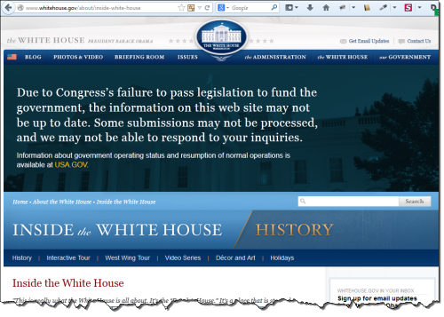
The nicest shutdown-related user experience was presented on sites like cdc.gov and whitehouse.gov. The Whitehouse website displayed a modal message on the first visit, informing users that information on the site may not be up to date, but yet allowed users to continue to the site.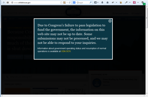 Unlike the Smithsonian National Zoo however, the site also displayed the same message on each page, just below the navigation. This served as a reminder for users as well as for the benefit of anyone who was dropped directly onto an inside page from an external link or a bookmark as shown below.
There is room for improvement in the visual presentation of the reminder, including the amount of space it takes up.
Of the three shutdown-impacted website user experience approaches, the third seemed to be in the best interest of users: giving them access to information, while reminding them that it was not business as usual. Hopefully the shutdown will soon be over and websites return back to serving their users.
Update: With some of the national parks temporarily open with state funding, the U.S. National Park Service has changed the way it presents the shutdown, falling into approach #2 above. Users can now browse select national parks with an alert message that is inconsistently presented on different park pages.
Leave a Comment